Overcoming market barriers
TAXit is a SaaS startup whose purpose is brilliantly simple: to make tax affidavit easier for everybody.
client
TAXit
role
UX/UI Designer
1.000+
7.500+
42%
25%
the challenge
After a year of the launch, they were ready to expand their user base beyond tech-savvy individuals but faced a challenge in making the app more user-friendly and accessible to a broader audience. They wanted to enhance the user experience while retaining advanced features.
Time and money were huge constrains. So I established a process to meet the goals within this parameters.
Building User Personas
User personas provided invaluable insights into the target audience's preferences and needs, guiding the redesign process to create a user-friendly app that catered to their specific requirements. I picked up 2 user personas at the extremes of the scope to cover a wide range of posible users to the product. By covering the extremes necessities, I assured that most of the user needs were going to be tackled.


Making an Heuristic Evaluation
An heuristics evaluation was the quickest and most affordable way to discover the major usability problems in the interface. This is what I've found.
-
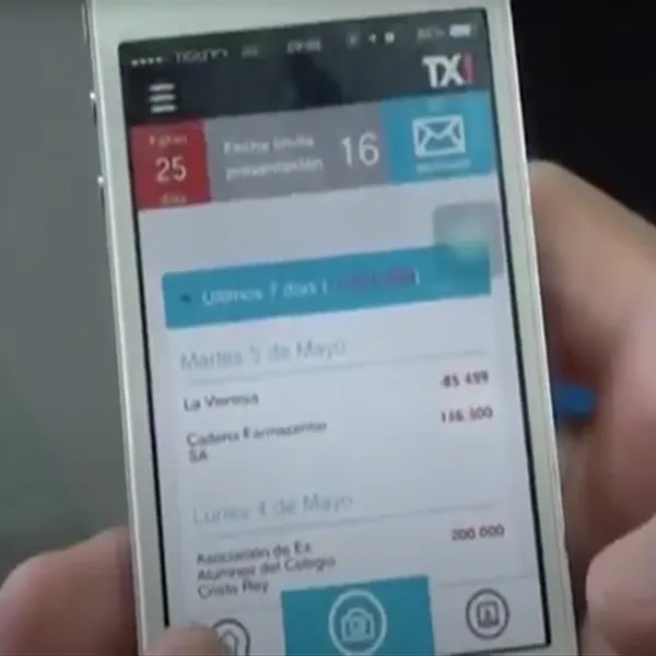
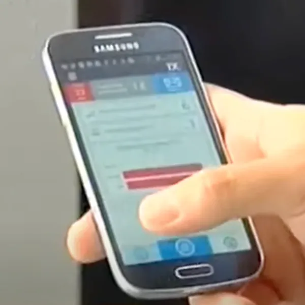
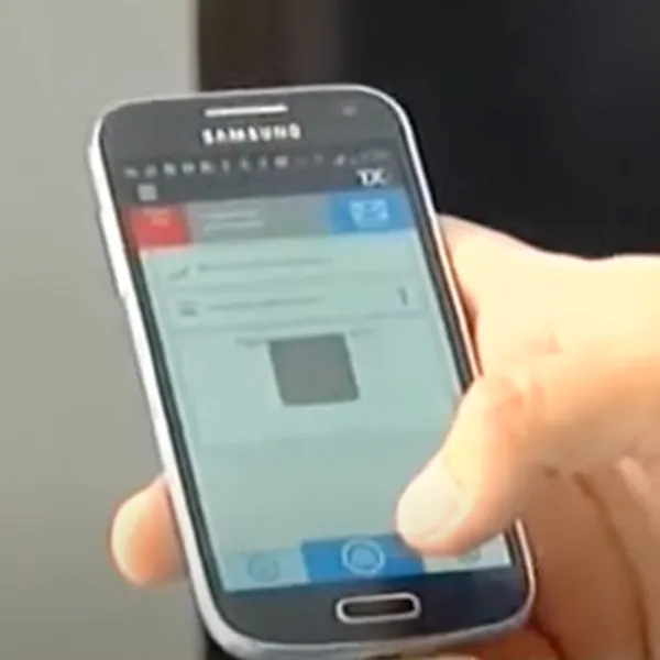
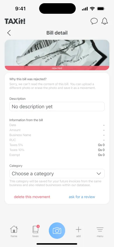
There was no clear information about the current state of the invoices sent.
-
There was no visual queues on what section the user is currently looking at.
-
The data in the main screen was overwhelming and not easy to navigate through all the information.
-
The days remaining for the affidavit presentation looked like a constant warning, raising a feeling discomfort in every screen.
-
The actions for the user to manage the invoices sent were very limited.
-
The main colors in the app and the identity in general -black & red- raised negative connotations within the financial standards.
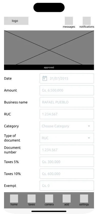
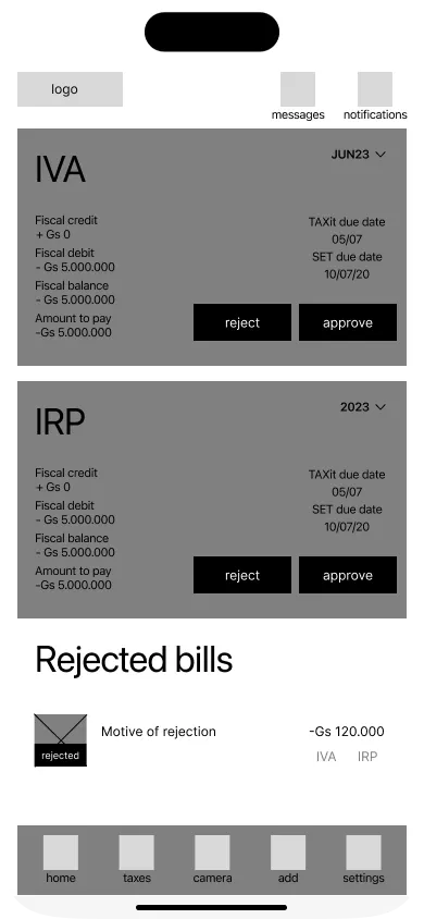
wireframing
To get approval of the stakeholders, I built a low fidelity prototype with all the features that were needed to be build. This also helped the developer, he could already start building all the backend needs while the final visuals were designed.
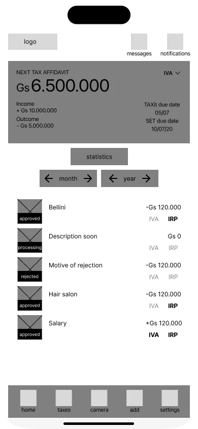

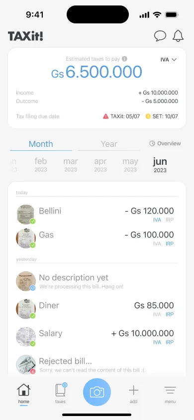
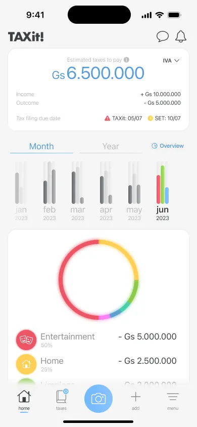
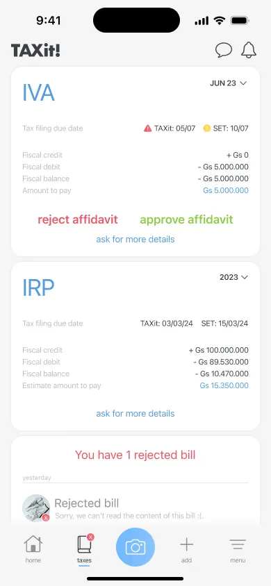
designing visually
The interface was designed with a clean and modern layout. The visual elements, such as icons and charts, were used strategically to present financial data in a visually appealing manner. The result was an simple interface that resonated with both tech-savvy users and non-technical individuals seeking an easy-to-use financial and taxes management tool.
what collaborators said

Working with Mauri is always a positive experience. His communication skills facilitates seamless collaboration. His clear and concise workflow ensures that everything runs smoothly. His collaborative approach consistently leads us to discover innovative solutions, which is evident in the final outcomes. Working with him is truly a pleasure!